
ATP Performance Report
Want to take a look at how your ATP inspections are performing?
Run the ATP Performance Report to see average scores and readings by Topic, Question, and Location. You’ll also get insights like:
- Average reading trends over time
- Average Inspection Score by Month
- Average Inspection Score by Day
(Note: Only Account Administrators & Managers can run reports.)
-
When signed in to the system, click on the Reports tab in the left-hand menu bar. Once the menu is open, click on the Performance - ATP report.

- There are 6 versions of this report that you can view by using the tabs at the bottom of the report.

a. Topic – Average readings and scores by topic (e.g., Door, Sink).
b. Question – Average readings and scores by specific questions (e.g., Bathroom Door, Room Door). Each topic can have multiple questions.
c. Location – Average readings and scores by location.
d. Distribution – Average reading per inspection over a selected date range.
e. Average Inspection Score by Month – Average inspection scores by month.
f. Average Inspection Score by Day – Average inspection scores by day.
Note: The title of the report will indicate the tab that you are viewing.

ATP Reading by Topic :
a. Average Score Gauge - A visual gauge showing your overall ATP compliance score. In this case, it's at 83% compared to the 90% target.
b. Topics List - A list of all the surfaces or objects tested (e.g., Bed, Sink, Toilet).
c. Average ATP Reading - The average ATP reading for each topic.
d. Average ATP Score - Shows the compliance score (%) for each topic based on your ATP thresholds.
e. Question Count - How many times each topic was inspected.

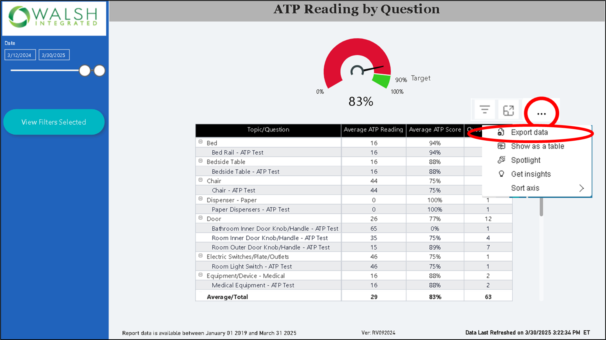
ATP Reading by Question :
a. Average Score Gauge - A visual gauge showing your overall ATP compliance score. In this case, it's at 83% compared to the 90% target.
b. Topic/Question List - Each Topic (e.g., Door) can be expanded to show its specific Questions (e.g., Bathroom Inner Door Handle, Room Outer Door Handle).
c. Average ATP Reading - The average ATP reading for each topic and question.
d. Average ATP Score - Shows the compliance score (%) for each topic and question based on your ATP thresholds.
e. Question Count - How many times each topic and question was inspected.

ATP Reading by Location :
a. Average Score Gauge - A visual gauge showing your overall ATP compliance score. In this case, it's at 83% compared to the 90% target.
b. Locations - The list of Locations that have been ATP Tested (i.e., Campus -> Building-> Floor -> Area-> Room).
(Note: click on the "-" button beside the location name to collapse that location node.)
c. Average ATP Reading - The average ATP reading for each location.
d. Average ATP Score - Shows the compliance score (%) for each topic based on your ATP thresholds.
e. Question Count - How many times questions were tested at that location.

ATP Reading Distribution :
a. Pass/Fail Color Legend - Each dot represents one inspection result's average reading:
🟢 Green = Pass (within acceptable range)
🔴 Red = Fail (above fail threshold)
🟡 Yellow = Caution (approaching fail threshold)
Note: Yellow will only appear if your system is set up to include a “Caution” range.
b. Average ATP Reading by Inspection Axis - the average ATP reading value for each inspection is shown on the chart (Y Axis).
c. Pass Threshold Setting - Adjust the Pass Threshold using the slider. This sets the RLU limit. In this example, the threshold is set to 100.
- Readings above this threshold appear above the dotted line.
- Readings below appear underneath.
d. Pass Threshold Line - The dotted line on the graph represents your set Pass Threshold value (i.e., 100).
e. Inspection Dates - Each dot is plotted by inspection date, shown along the bottom of the graph.

Average Inspection Score by Month:
a. Pass/Fail Color Graph Legend- Each dot shows the average inspection score for the months selected.
🟢 Green = Pass (indicates acceptable average ATP inspection scores)
🔴 Red = Fail (indicates unacceptable average ATP inspection scores).
b. Score Axis - the average inspection score percentages (Y-axis).
c. Pass Threshold Slider - This slider lets you set the minimum score (%) needed to pass. In this example, the threshold is set to 90%.
- Readings above this threshold appear above the dotted line.
- Readings below appear underneath.
d. Pass Threshold Line - The dotted horizontal line represents the threshold you set (90% here). It's a quick visual cue for comparing monthly scores.
e. Months - Each data point is tied to a specific month, giving you a month-to-month view of performance.

Average Inspection Score by Day:
a. Pass/Fail Color Legend - Each dot shows the average inspection score for a specific day:
🟢 Green = Pass (indicates acceptable average ATP inspection scores)
🔴 Red = Fail (indicates unacceptable average ATP inspection scores).
b. Score Axis - daily average inspection score percentages (Y-axis).
c. Pass Threshold Slider - This slider controls the minimum score required to pass. In this example, the threshold is set to 90%.
- Readings above this threshold appear above the dotted line.
- Readings below appear underneath.
d. Pass Threshold Line - The dotted line on the graph represents your set Pass Threshold value (i.e., 90%).
e. Inspection Dates - Each data point is tied to a specific inspection date, giving you a day-by-day view of performance.

-
To export the report, click the "..." icon at the top right-hand corner of the report table and then click on Export Data.
- To open the report in Full Screen click on the arrows at the top right-hand corner of the report.


-
To focus/expand on the report table, click the Focus Mode icon.

- To sort the data by ascending or descending, click on the column title you want to sort by in the report.

Note: The example below is sorted by Average ATP Score.

- By clicking on the blue View Filters Selected button on the blue left-hand menu, you can filter on the following parameters:
a. Date Range
b. Evaluator
c. Operator
d. Assignment
e. Inspection Template
f. Location (campus, building, floor, area, room)
g. Location Model
The report data will update automatically as the filters are applied.

Click on the blue "Clear Filters" button on the top right corner of the filters menu to remove the applied filters or click the back arrow to collapse the filter menu.
Summary
The ATP Performance Report helps track how well ATP inspections are performing by showing average ATP readings and scores by topic, question, location, and over time (daily/monthly).